Designers, like most professionals in their field, are picky about jargon. And so, we dare-I-say arrogantly present this blog series: Tales of Jargon. Sling out these fancy terms the next time you’re with your designer friends (or with us, the designers at Gliffen) and watch the fireworks ignite, the eyes light up, the mouth agape.
___________________________
It is safe to assume that even laymen have heard the following names:
Times New Roman
Futura
Helvetica
Garamond
It is also safe to assume that a sizable portion of the population refers to those names as “fonts.”
i.e. “Billy Joe, what’s that font the notable director Wes Anderson uses all the time?”
“Oh, that font? It’s Futura.”

And, yes, it’s true that Wes Anderson is a lover of Futura. But, the font Futura does not exist. The typeface “Futura”, however, is alive and well, bright eyed and bushy tailed.
What is the difference, then, between a font and a typeface? Let us illustrate the variance.
Do you have a family? Most do. I hope you do, too! Within a family are typically several members. Let’s create a fictional family and give them names for the sake of our illustration. The last name of this family is Beta. The family members of Beta are:
Bo Beta, who is tall and thin.
Mo Beta, who is short and wide.
Ro Beta, who is tall and bold.
And Xo Beta, who is condensed and bold.
We can think of Bo, Mo, Ro, and Xo as fonts. All of these fonts reside within one family, or typeface, Beta.
The typeface is the family. And within each family are members, or fonts.
Going back to the example of Futura.
Futura is what? That’s right, the typeface.
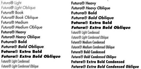
And within that typeface are several fonts, including:

These are fonts. ^ And, they all exist within one tidy, beautiful typeface. Futura.
Once more, the typeface is the family. The fonts are the members of that family.
Let’s rewrite the conversation with Billy Joe from earlier.
“Billy Joe, what’s that typeface the notable director Wes Anderson uses all the time?”
“Oh, that typeface? It’s Futura. But, he seems to be particularly fond of the font Futura Bold.”
You don’t know how happy jargon lessons make me.
Yours,
Perfectly Posh

