 So as graphic and web designers it’s difficult to not judge font choice. You have even more flexibility in print work because the fonts are pretty boundless. Now for web there are some web safe fonts that are wise to stick with so the font display is pretty consistent for each visitor, no matter the browser they use.
But God forbid, let’s steer away from Arial and Times New Roman and let’s move to other serif¹ or sans-serif² fonts that just have more character, cleaner and newer. Visit Google Fonts to give you great up-to-date font choices.
- Serif – a serif is a small decorative flourish on the end of the strokes that make up letters and symbols.
- Sans Serif- “sans” (to be without) Serif fonts do NOT have any flourishes at the end of the strokes.
Did you see this SNL skit this past Saturday?
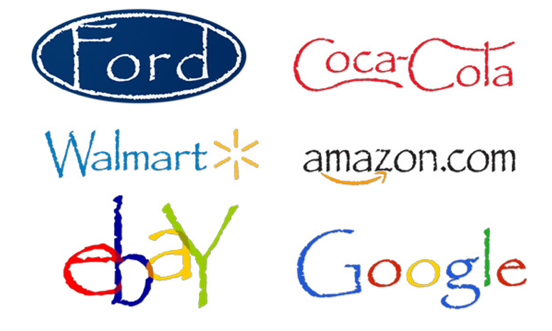
This may have resonated with many designers and could leave some people scratching their heads like “what’s the big deal? That’s a cool font.” Trust in your fellow designer friends that it’s just not a font you want to use again, unless it’s purely a joke and then that’s okay. So kudos to SNL for making this skit come to life, Ryan Gosling did a great job really capturing the frustration and the dramatic effect of what a mere font can do.
FYI, the Font No-No List:
- Papyrus
- Comic Sans
- Times New Roman
- Bradley Hand ITC
- Kristen ITC
- Impact


