

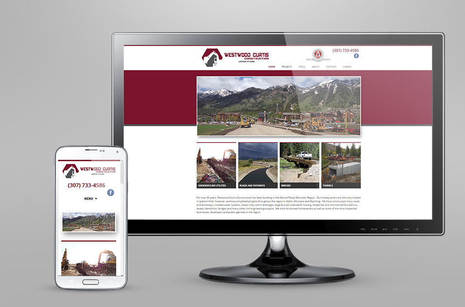
Responsive Design
With an increase in the use of mobile devices to access the internet, it’s crucial to have a responsive design for your website. By having large and smaller screen designs of your website, you can ensure that your client’s experience is maximized wherever they are.
 Jake Rocheleau, in his blog “How to Plan Content Arrangement for Responsive Design,” outlines ways to arrange the content of your full site into a responsive design.
He suggests breaking down website grids into list forms. This allows a user from a mobile device like an Iphone or an Android to easily scroll down through the page.
Consider both the height and width of potential devices that may access your site. Furthermore, it’s important to keep a balance of providing enough information with readable text. You will likely have to hide your navigation in a “hamburger” or list it under your logo. You may have to drop less important material further down the page.
Occasionally, you will need to remove additional sidebars or drop them below the main content. This will allow you to access the material vertically, a crucial component of those smaller, thinner devices.
You will likely have to remove the cushion or margins around your various blocks of information. This will allow for more content and will streamline your design.
Finally, he suggests that web users today expect all websites to be mobile friendly. Having a responsive design for your website is both common and crucial to connecting with your clients. If you would like a responsive design for your website, please Gliffen Designs at 307-200-8999.