Border Radius was a concept released with CSS3 that allows you to create rounded corners on objects without the use of the traditional background images. Previously if you wanted to create a box that looks like this:
You would need to create a series of images that would be placed on the various corners which would make it look curved. But not anymore. Now this can be accomplished as easy as this:
.ob{
    -webkit-border-radius: 10px;
    -moz-border-radius: 10px;
    border-radius: 10px;

    /* these properties are just so that you can see the box*/
    background-color:#999;
    width:300px;
    height:100px;
}
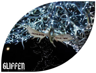
But it doesn’t stop there. You can even attach these properties to an image. You can create this effect:
using this code:
img{
    -webkit-border-top-left-radius: 200px;
    -webkit-border-bottom-right-radius: 200px;
    -moz-border-radius-topleft: 200px;
    -moz-border-radius-bottomright: 200px;
    border-top-left-radius: 200px;
    border-bottom-right-radius: 200px;;
}


